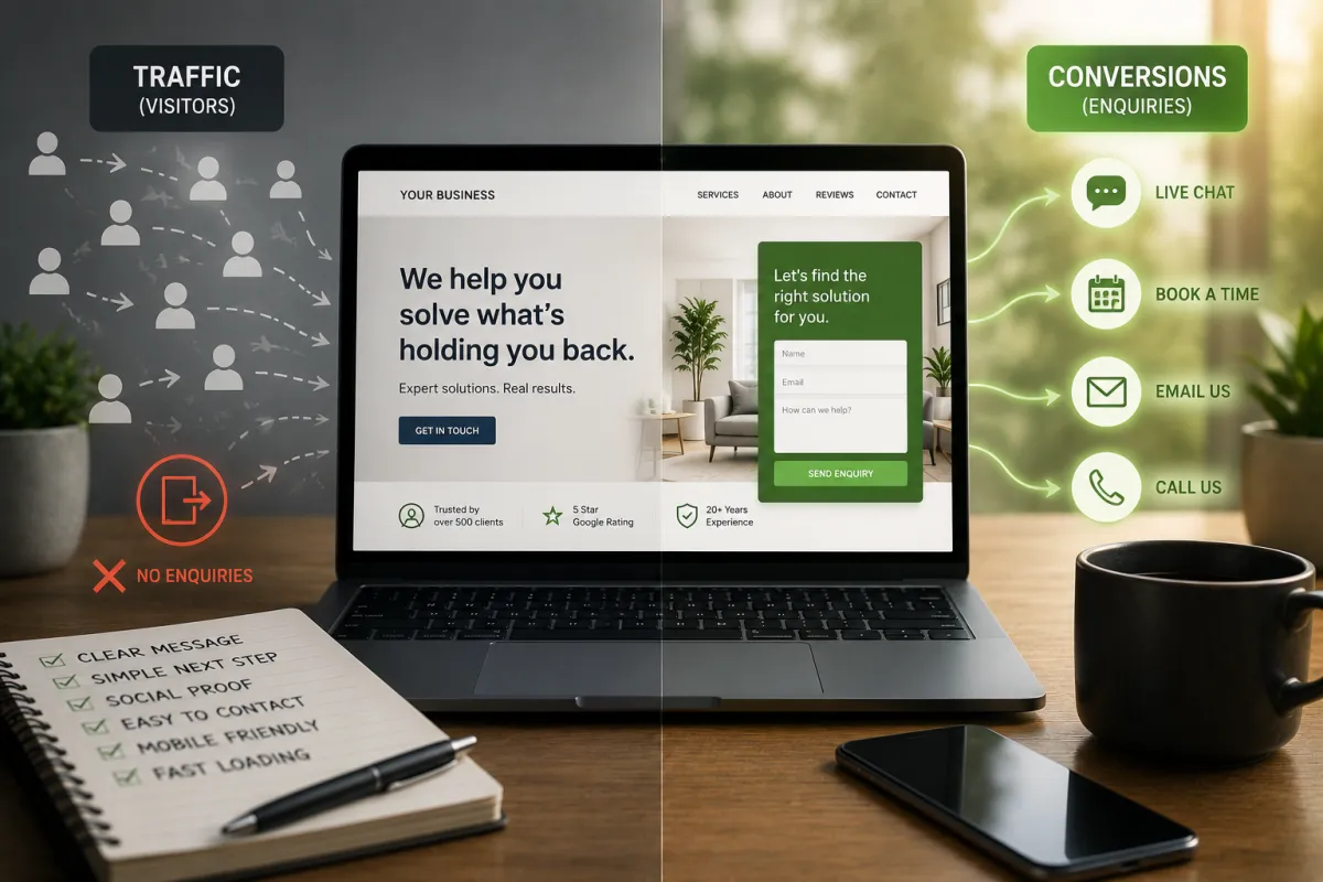
Your Website Is Getting Traffic.
So Why Aren't the Enquiries Coming?
Traffic Without Enquiries Is a Different Problem
There's a particular kind of frustration that comes with watching Google Analytics while the phone stays quiet. You can see people visiting your site. You can see they're spending time on pages. And yet nothing converts.
Most business owners in this situation do one of two things. They spend more on ads to get more traffic. Or they rebuild the website from scratch. Both are expensive answers to the wrong question.
Traffic without enquiries is almost never a traffic problem. It's a conversion problem. And conversion problems are almost always fixable without spending more money to get people to the site.
Picture a shop with a window display that stops people in the street. They come in, look around, pick things up, and then walk out without buying. The footfall isn't the issue. Something inside the shop is putting them off. Maybe the prices aren't marked. Maybe nobody greeted them. Maybe they couldn't figure out where to pay. A website works the same way.
The average service business website converts between 1 and 3 percent of visitors into enquiries. That means for every 100 people who find you online, 97 or more leave without contacting you. Some of that is unavoidable. But most of it isn't.
The Seven Reasons People Leave Without Contacting You
1. It's not clear what you do in the first five seconds
When someone lands on your homepage, the first question in their head is 'is this for me?' If your headline talks about who you are rather than what you solve, they'll leave before they scroll. Most service business websites lead with the business name and a tagline. Neither of those answers the visitor's question.
Fix: Your headline should name the problem you solve and who you solve it for. Nothing else should come above it.
2. There's no clear next step
Walk through your site right now and ask: what is the one thing I want a visitor to do? If the answer is 'well, there are a few options,' that's the problem. Most websites have three or four calls to action competing for attention. When everything is a priority, nothing is. Visitors reach the bottom of a page and don't know what to do next, so they do nothing.
Fix: Every page needs one primary action. One button, one goal. Everything else is secondary.
3. The contact options create friction
If your only contact option is a phone number during business hours, you're relying on the visitor to be available, motivated, and willing to call a stranger right then and there. That's a lot to ask. Most people will put it off and forget. A long contact form with eight required fields has the same effect. The easier you make it to reach out, the more people will.
Fix: Add a short form (three fields maximum), a click-to-chat option, and an online calendar. Match the contact method to how your audience prefers to communicate.
4. There's no social proof where decisions are made
Reviews, testimonials, and case studies do a lot of heavy lifting. But most businesses put them on a separate 'testimonials' page that very few people visit. If social proof isn't on the page where a visitor is deciding whether to contact you, it's not doing its job. Trust needs to be built at the point of decision, not somewhere else on the site.
Fix: Put your two or three strongest testimonials on your homepage and your services page, right next to your call to action.
5. The copy is about you, not them
Read through your website and count how many times you say 'we' versus how many times you describe the visitor's problem. Most service websites are written from the inside looking out. 'We offer,' 'we specialise in,' 'we've been operating since.' The visitor doesn't care about any of that until they've decided you can solve their problem.
Fix: Rewrite your opening section to lead with the problem your client is experiencing. Save the about-us angle for after you've hooked them.
6. The site doesn't work on mobile
More than 60 percent of website traffic in Australia is now from mobile devices. If your site loads slowly on a phone, has buttons that are too small to tap, or requires horizontal scrolling, a significant portion of your visitors are having a frustrating experience and leaving because of it. This is not a design issue. It's a revenue issue.
Fix: Test your site on your own phone right now. If it's awkward to use, your visitors are experiencing the same thing.
7. There's no low-commitment option for people who aren't ready yet
Not everyone who visits your site is ready to call you today. Some are researching. Some are comparing options. Some are warming up to the idea. If your only option is 'book a call' or 'contact us,' you lose everyone who isn't ready for that step. A free resource, a quiz, or a short guide gives those people a reason to stay connected until they are ready.
Fix: Offer something free and useful in exchange for an email address. A checklist, a quiz, or a short guide. Then follow up with them over time.
The Order of Fixes Matters
Don't try to fix everything at once. Pick the highest-impact change and implement it before moving to the next one. Based on what I see most often, the order that gets results fastest is:
Fix your headline first. If a visitor doesn't understand what you do in five seconds, nothing else on the page matters.
Simplify your call to action. One button, one goal per page.
Move your best testimonial above the fold. Don't hide your strongest proof at the bottom.
Test the mobile experience. Open your site on your phone. Time how long it takes to load and how easy it is to find the contact option.
Add a low-commitment entry point. A quiz, a checklist, or a free download for people who aren't ready to call yet.
A website is not a brochure. A brochure's job is to look good. A website's job is to turn visitors into enquiries. Those are different jobs and they need different thinking.
This is the single most useful reframe for any service business website review.
What I've Seen in Practice
In over 20 years of working inside and alongside service businesses, I've sat through a lot of website reviews. The businesses that fix their conversion rate consistently see more enquiries without changing a single thing about their marketing spend or their ad targeting.
One of the most common things I hear is 'we tried changing the website and it didn't help.' When I look at what changed, it was usually the design. New colours, new images, a fresh layout. The copy was the same. The call to action was the same. The contact form was still eight fields long. Design is not the lever. Clarity and ease are the levers.
The businesses that do it well have one thing in common: they've stopped thinking about their website as a digital business card and started treating it as their best salesperson. A good salesperson doesn't talk about themselves. They ask good questions, they show they understand the problem, and they make it easy to say yes.
Frequently Asked Questions
Sources referenced
Marketo Research | Microsoft Research (Attention Spans) | Chartbeat Content Analytics | HubSpot Marketing Statistics | Google PageSpeed Research | BrightLocal Local Consumer Review Survey
Individual results vary based on industry, traffic source, and existing site quality.

Take the Freedom Checker Quiz
You're doing well. But you know there's another level you haven't reached yet. This 27-question quiz shows you exactly where your time is going — and what to fix first to get some of it back.
Show Me Where My Time Is Going →